The work had evolved. The brand hadn't.
Arke spent more than a decade earning a reputation in Atlanta's digital scene. That was the problem. The market still saw a dev and Sitecore shop. The company had become a strategic digital partner, and the brand needed to say so. The brief was a logo. The real work was closing the gap.
- Brand Strategy
- Brand Identity
- Design System
- Presentation Design
- Web Design
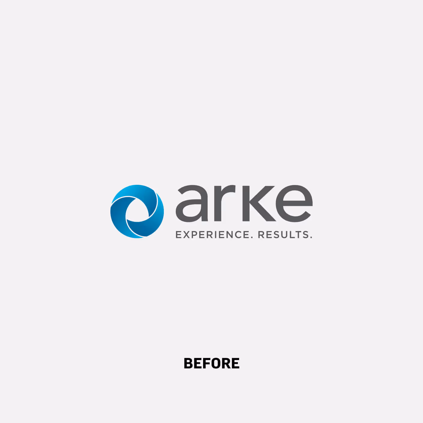
Arke wasn't a startup with no equity to its name. It had history, a client base, and a real reputation around Atlanta. The reputation just hadn't kept pace with the company. Earlier rebrands had refreshed the look without moving the perception. By 2021, a dated logo and narrow palette were still telling the old story: capable execution shop, not strategic partner. Their new Chief Strategy Officer came to us to fix the logo. We saw a repositioning hiding inside a design request.
We treated the identity as the carrier of the new story, not a fresh coat of paint. If the goal was to be seen as a strategic partner, the brand had to read as one on sight, before anyone clicked into a case study or sat through a pitch. Every decision laddered back to one question: does this say strategic digital partner, or does it say dev shop?
A modern, ownable brand that finally matched the company behind it, built to scale across every application from an email signature to a tradeshow wall. The identity held up as Arke grew, and Arke was later acquired by MSQ Partners, moving into that next chapter with a brand built for it.
A new look wasn't the point.
The perception was.
Plenty of agencies would have taken the logo brief and delivered a nicer logo. The before and after look better, everyone moves on. We pushed on the thing underneath. A brand that says dev shop keeps attracting dev shop work, no matter how good the company has gotten. The redesign had a job bigger than looking current. It had to move Arke from how the market remembered them to what they had actually become.
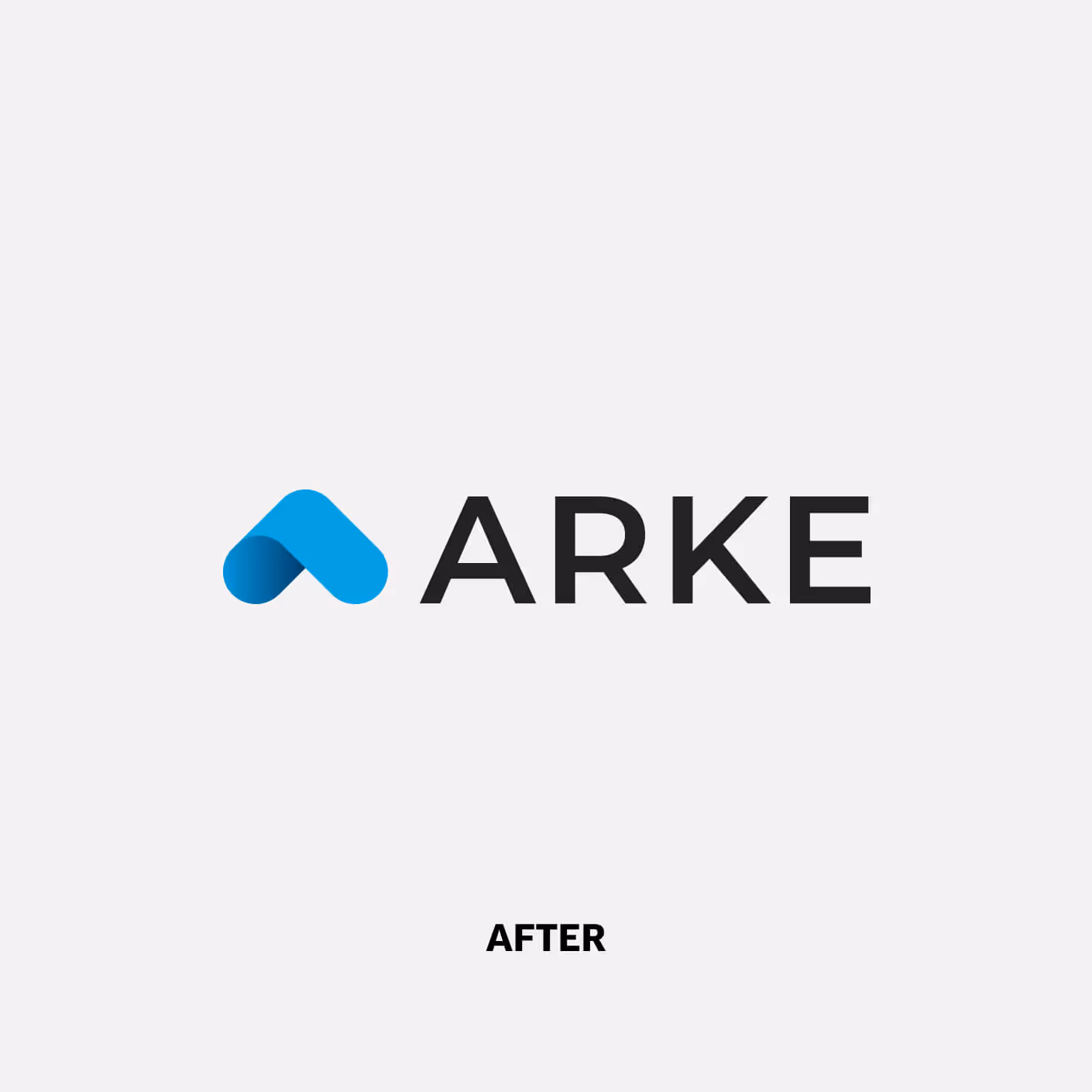
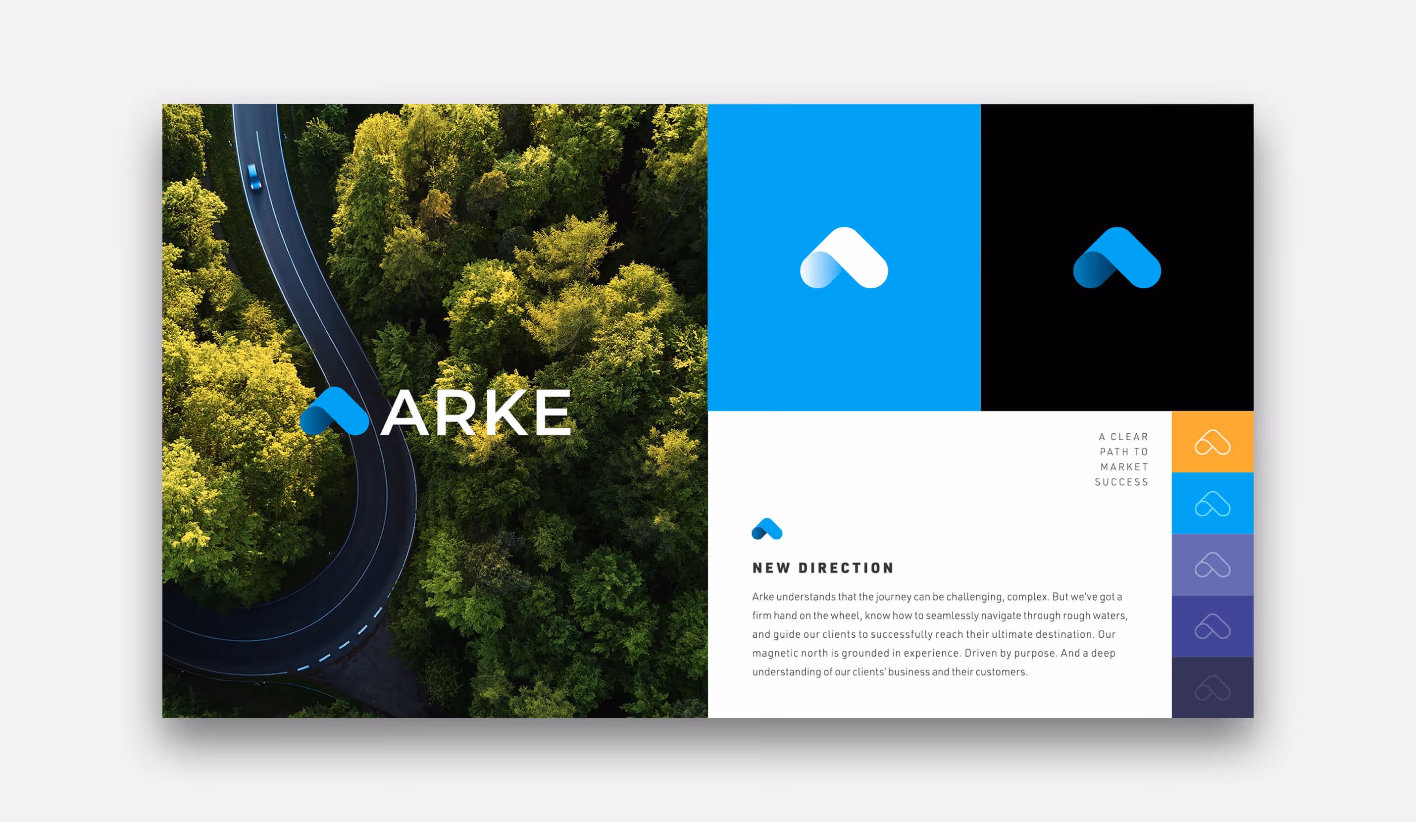
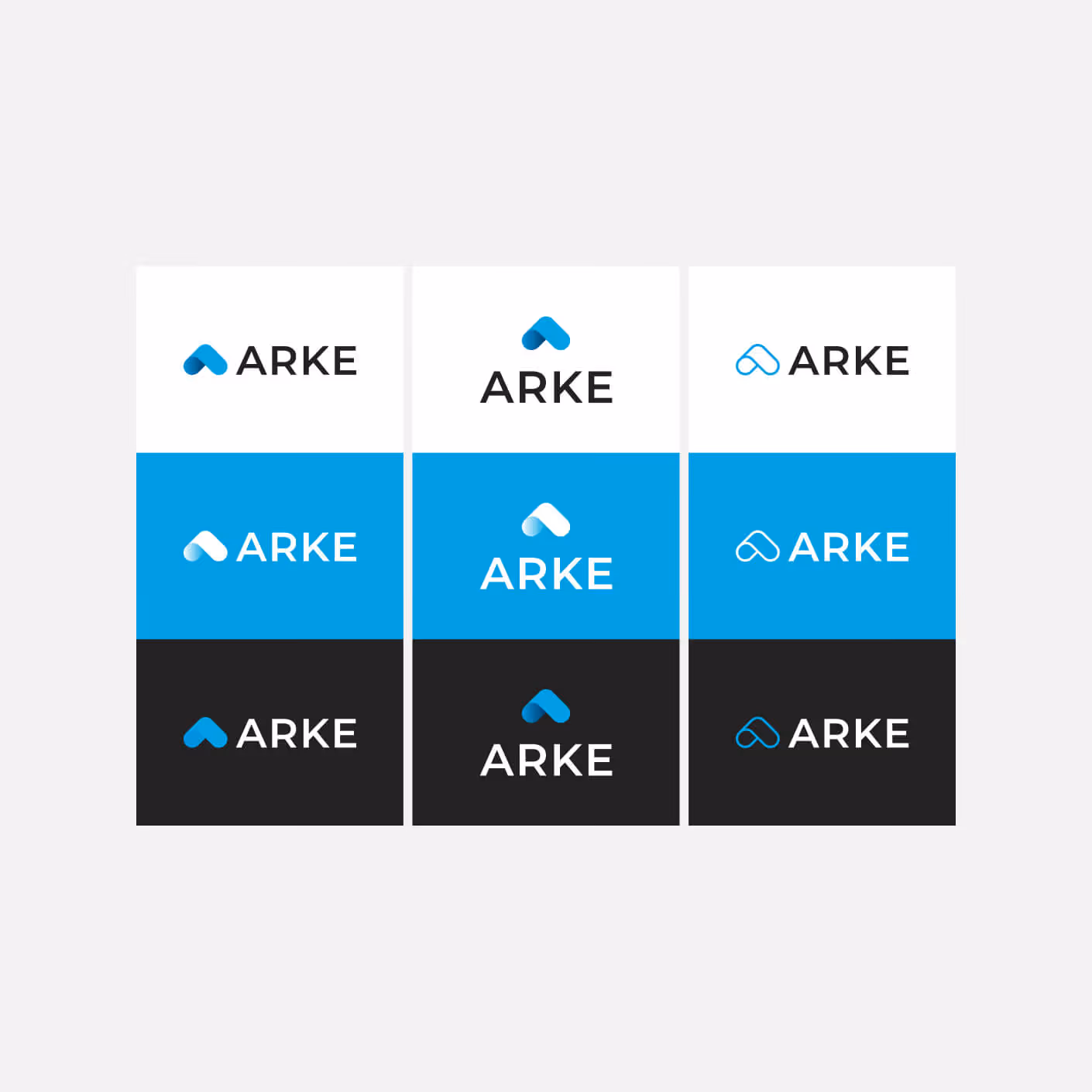
One mark, three meanings.
The old logo did one thing, and not especially well. We built one that works three ways at once. The capital A. An upward arrow. Layered gradients that read as depth, and not just the visual kind. Depth of capability. It was designed to be ownable, to animate cleanly, and to hold up at every size from a favicon to a conference banner. The palette did its share too. The old felt a bit flat. The new system runs on a confident blue with enough range to move without ever losing itself.
A logo doesn't reposition a company.
A system does.
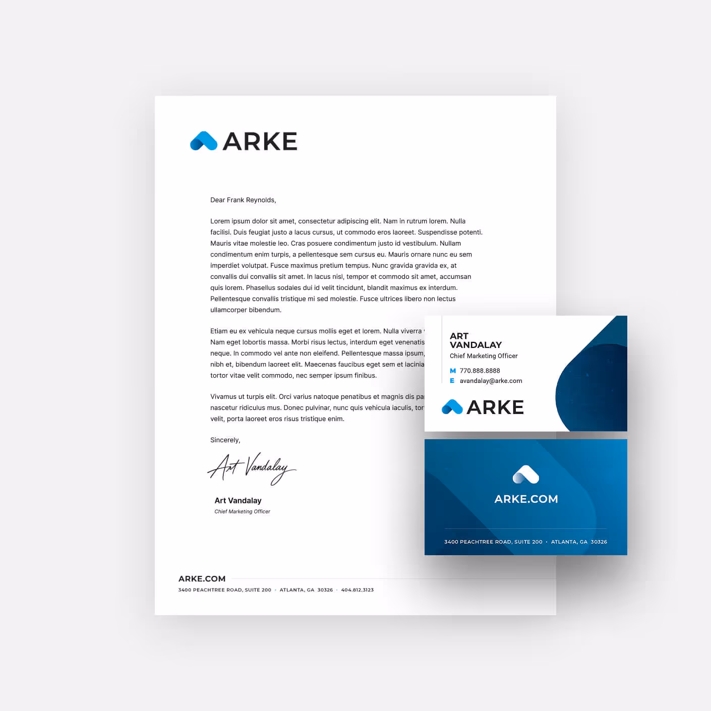
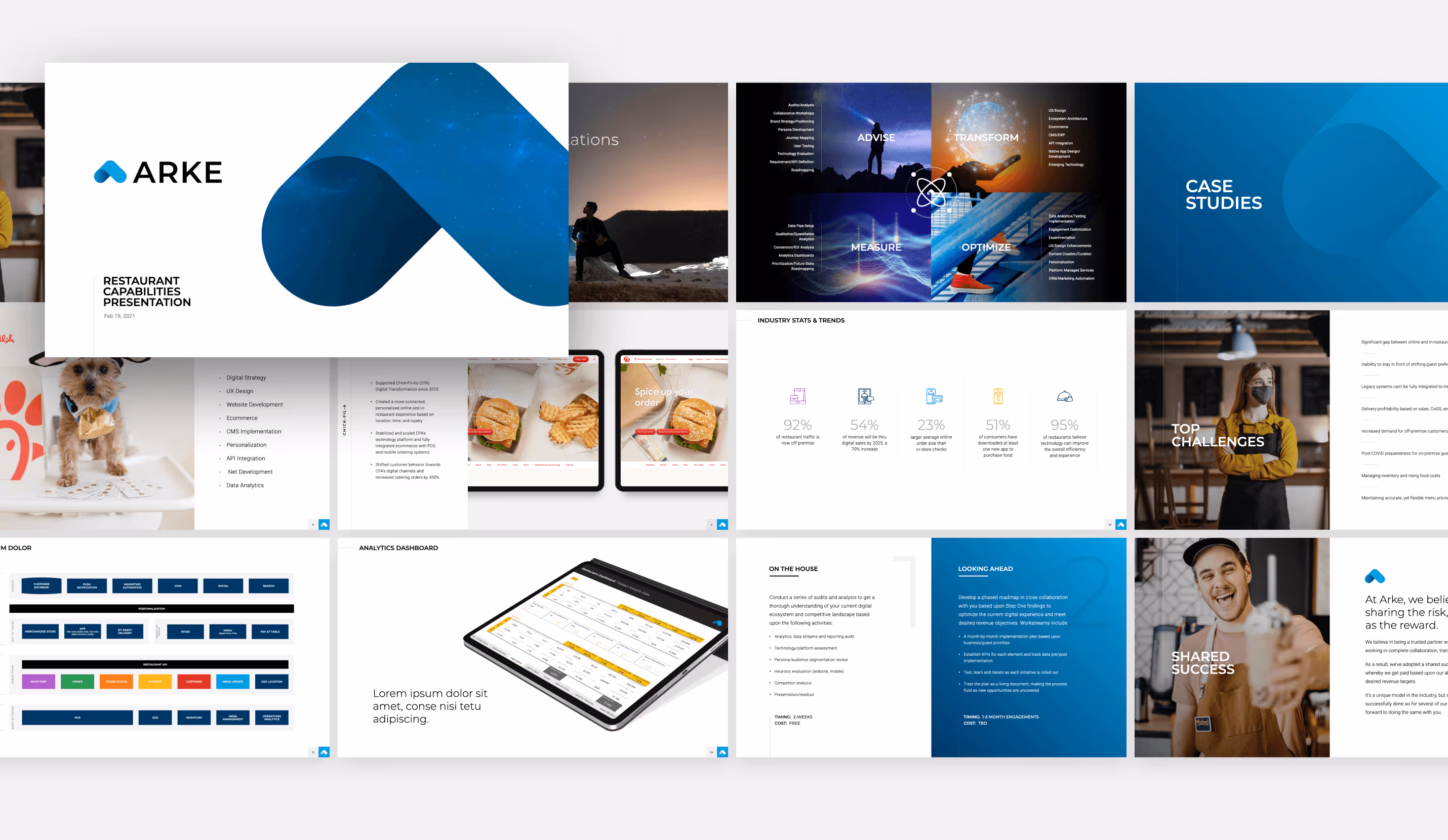
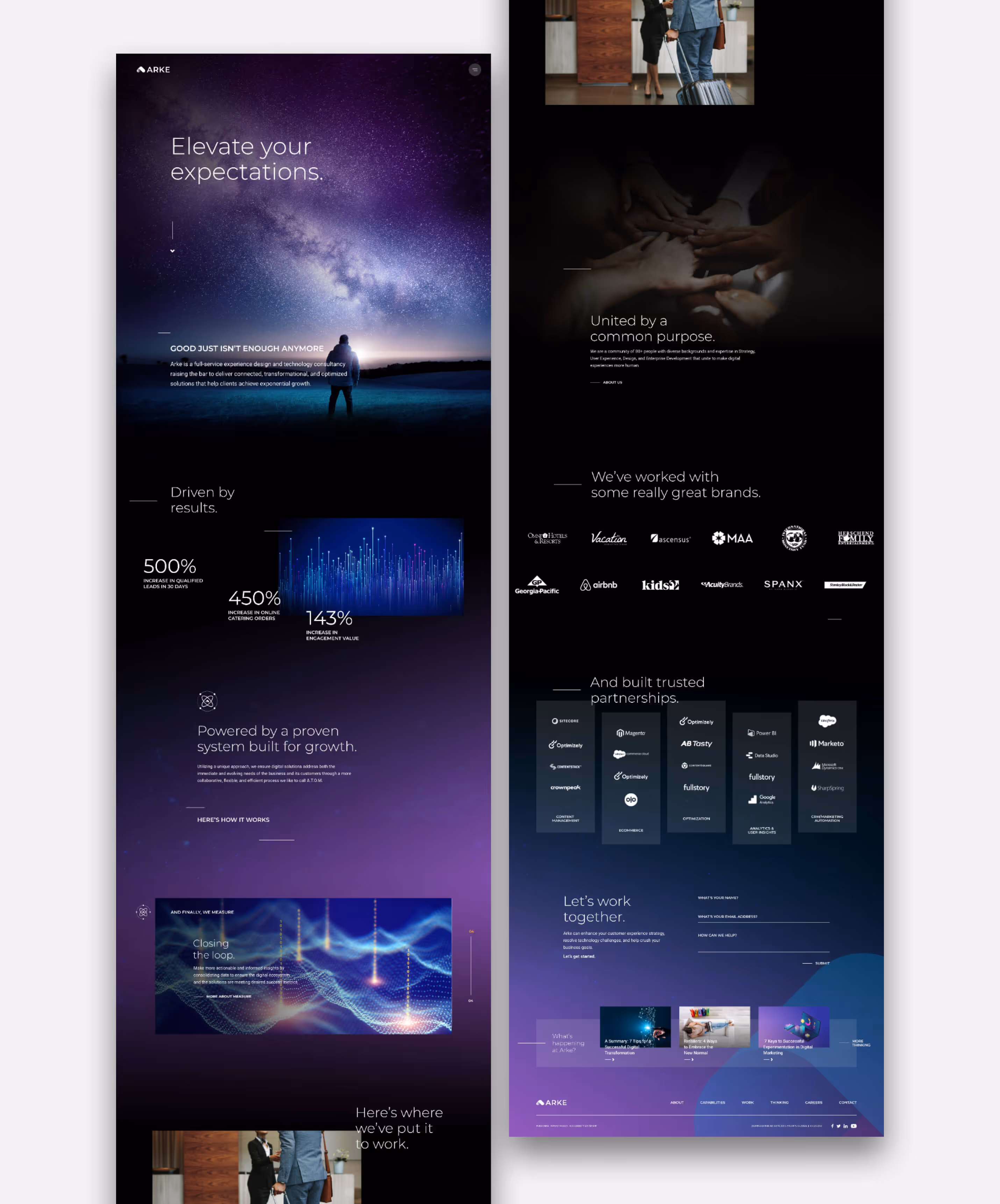
So we kept going, because the need kept revealing itself. Stationery that carried the brand into every conversation. Pitch deck templates so the sales story looked as sharp as the work behind it. Email signatures so no touchpoint went off-brand. And the website, where the new positioning had to do its hardest selling. Start to finish, one full identity.
Built to grow into.
The mark was built to signal depth, visual and otherwise. That turned out to be the right bet. Arke kept growing and the brand grew with them, right up until they were acquired by MSQ Partners. The depth the rebrand was built to communicate turned out to be real. A respected company, finally seen for what it had become.